Parallax web design is a technique that creates the deception of depth in web pages, by having different elements (or constructs) on the page moving at distinct speeds at the moment the user performs a scroll movement.
In this post, we will discuss the basics of what is parallax web design, followed by a look at some websites that generously use this style, and have arrived at the point of epitomizing it outright.
What is Parallax Web Design?
As stated in the first paragraph, the elements move at different speeds, yet this is more pronounced (and has a visible and more profound effect) when a single, large item (such as the background of the page) is anchored and the rest of the smaller elements have a disconcerting movement in relation to it. Of course, that is only one way (the most common way) of achieving the desired effect.
The technique first appeared in the challenges encountered by gaming developers, as they needed to achieve 2D scrolling effects. They did it by designing a remote background, upon which the multiple secondary items interacted, and the viewer was presented with a constant shift in perspective.
Parallax web design used to be produced exclusively through JavaScript, however, the implementation of CSS 3 has successfully circumvented the need for JavaScript, due to it delivering results that are much smoother.
This technique is a useful presence in the arsenal of a web designer as it can stun the user visually with some interesting animation, provide differing ways of guiding a visitor throughout a website (which has the corollary of increasing the time spent on the site as the user will continue scrolling to see what happens), not to mention creating pre-defined routes of exploration for the visitor.
The downsides of parallax web design start in the SEO department as the number of elements you have at your disposal (for filling them with relevant information) are not as many, a considerable increase in loading times, not to mention the havoc it can wreak for mobile applications.
There are several methods of obtaining parallax scrolling:
- Layers practice: differently defined layers are set to move in differing directions and at varying speeds when the user scrolls. The movement can be pre-defined or user-defined, an option formerly possible only with the use of JavaScript.
- Raster method requires the refreshing delay of individual pixel lines within an image and their disposal in a top to bottom fashion.
- Sprite is a direct consequence of the aforementioned gaming lineage of parallax web design, as an image is positioned at varying angles, with select parts of it becoming visible. Furthermore, this method is used to create a 3D illusion on flat images.
- Pattern manipulation is the simplest technique of them all (at least in theory) as it entails the floating of various screens over a sequence of backgrounds.
Examples of Successful Implementation
As is the case with every (relatively) novel method there are advocates and detractors of whether and where it should be used. Nevertheless, in the cases of these websites, the implementation of parallax web design has worked wonders, especially when considering minimal parallax web design templates.
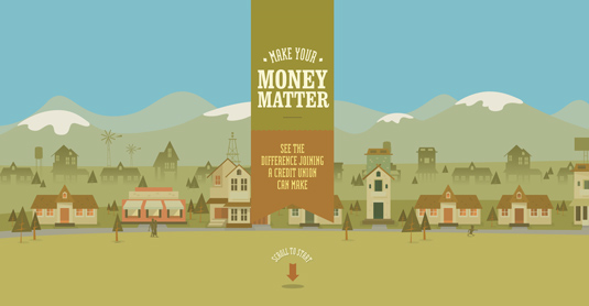
- Make Your Money Matter is a great example of parallax design used to enhance the experience of the user because it takes a rather boring subject (the site is about finance and banking for the Public Service Credit Union) and transforms it into an enjoyable experience through ingeniously implemented animation. An interactive and fun way to learn the benefits brought by joining a credit union.
- Why Your Brain Craves Infographics is a nicely put together set of infographics that feeds information directly to your brain. Hard to imagine that this engaging suite of infographics has been assembled just with the use of HTML5 and CSS3.
- Every Last Drop – ecology has never been more fun. A cute little narrator-character takes us through the pitfalls of water wasting and raises alarm bells in a manner that traditional awareness campaigns simply cannot compete with. It seems parallax web design can be employed to promote a variety of causes.
- Cultural Solutions uses parallax design to increase the appeal of their logo and add a bit of spice to the landing page of their website. Man has been fascinated by circles since the times of Archimedes, yet the playful dialogue between the shapes in the foreground and those in the background would impress even the old master.
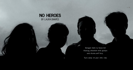
- Pitchfork Cover Stories – Pitchfork revolutionizes the craft of journalistic storytelling through the inventive presentation of aspiring artists. While retaining the feeling of the tested newspaper interface, separate blocks are created through which the textual information initiates a dialogue with the visual information. The pages move at different speeds providing the user with an ever-changing landscape that is clearly more appealing than the one-dimensional traditional presentation.
Parallax web design is already used with results that can make the eye marvel as we have seen from this series of examples. One can only expect the trend to continue and for us to have experiences that breathe variety every time we surf the web.